How To make Responsive Card With only CSS Grid
Flexbox? Chuck that sh*t out of the window😂

I am a web developer mostly focusing in react js.
I would say it is easier to make a beautiful and responsive card with CSS Grid then with Flexbox, mostly because of grid-template-areas. Now you can download the starter file from my github page and go directly to Desktop Layout section or you can just follow along.
Setting Up HTML and CSS
If you have download my project and it is working fine then go to the next section and follow along if not then Lets setup our Project
Html
In our html lets make a div with the class card and grid-card
 <body>
    <div class="card grid-card"></div>
  </body>
This card is a premade class in our stylesheet which you can copy after setting up our html. This grid-card is where we will put our grid styling. Then inside this card lets have an image with the class of image,
<body>
    <div class="card grid-card">
      <img src="./image/portfolio Image.jpg" alt="" class="image" />
    </div>
  </body>
For the image just put an image from Unsplash after that we need a title so a h3 with a class of title called Portfolio Website
<body>
    <div class="card grid-card">
      <img src="./image/portfolio Image.jpg" alt="" class="image" />
      <h3 class="title">Portfolio Website</h3>
    </div>
  </body>
then span with a class of date and text-subtle, this text subtle is also a custom class I made, and this date is to know when this project was made so inside write something like Sep 2022
<body>
    <div class="card grid-card">
      <img src="./image/portfolio Image.jpg" alt="" class="image" />
      <h3 class="title">Portfolio Website</h3>
      <span class="date text-subtle">Nov 2022</span>
    </div>
  </body>
now lets have a small discription of this product by having a paragraph tag with a class of discription and inside we will have a simple lorem text
<body>
    <div class="card grid-card">
      <img src="./image/portfolio Image.jpg" alt="" class="image" />
      <h3 class="title">Portfolio Website</h3>
      <span class="date text-subtle">Nov 2022</span>
      <p class="discription">
        Lorem ipsum dolor sit amet consectetur adipisicing elit. Labore magnam
        molestias sapiente voluptate debitis quis consectetur laborum nesciunt
        impedit hic. Alias, labore ullam. Explicabo aliquam deleniti laborum,
        minima tempora ad.
      </p>
    </div>
  </body>
then lets have a small section in which you show what languages or what software you used to build this project. for that lets have a div with the class of madewith, then a div with class of madewith-title and text-subtle where we write Made With below our paragraph
<body>
    <div class="card grid-card">
      <img src="./image/portfolio Image.jpg" alt="" class="image" />
      <h3 class="title">Portfolio Website</h3>
      <span class="date text-subtle">Nov 2022</span>
      <p class="discription">
        Lorem ipsum dolor sit amet consectetur adipisicing elit. Labore magnam
        molestias sapiente voluptate debitis quis consectetur laborum nesciunt
        impedit hic. Alias, labore ullam. Explicabo aliquam deleniti laborum,
        minima tempora ad.
      </p>
      <div class="madewith">
        <div class="madewith-title text-subtle">Made With</div>
        <div class="madewith-content">Html</div>
        <div class="madewith-content">Css</div>
        <div class="madewith-content">Javascript</div>
      </div>
    </div>
  </body>
and finally below our madewith div lets have a button for demo called demo-button and write demo. The final HTML Looks something like this.
<body>
    <div class="card grid-card">
      <img src="./image/portfolio Image.jpg" alt="" class="image" />
      <h3 class="title">Portfolio Website</h3>
      <span class="date text-subtle">Nov 2022</span>
      <p class="discription">
        Lorem ipsum dolor sit amet consectetur adipisicing elit. Labore magnam
        molestias sapiente voluptate debitis quis consectetur laborum nesciunt
        impedit hic. Alias, labore ullam. Explicabo aliquam deleniti laborum,
        minima tempora ad.
      </p>
      <div class="madewith">
        <div class="madewith-title text-subtle">Made With</div>
        <div class="madewith-content">Html</div>
        <div class="madewith-content">Css</div>
        <div class="madewith-content">Javascript</div>
      </div>
      <button class="demo-button">Demo</button>
    </div>
  </body>
CSS
Just Copy and paste this preset CSS where we have a simple CSS Reset from this link and some custom classes.
@import url("https://fonts.googleapis.com/css2?family=Poppins:wght@500;700&display=swap");

:root {
  --color-primary: #f8c77e;
  --color-link: #4d62ff;
  --color-success: #77dd66;
  --color-warning: #ffc839;
  --color-danger: #ff6961;
  --color-input-field: #07284b;
  --color-disabled: #06213e;
  --color-card: #051d37;
  --color-background: #031425;
  --color-heading-text: #fafcfd;
  --color-body-text: #c2c1c0;
  --color-button-text: #262624;
  --color-subtle: #61617a;

  --border-radius: 0.5rem;
}

/* Box sizing rules */
*,
*::before,
*::after {
  box-sizing: border-box;
}

/* Remove default margin */
body,
h1,
h2,
h3,
h4,
p,
figure,
blockquote,
dl,
dd {
  margin: 0;
}

/* Remove list styles on ul, ol elements with a list role, which suggests default styling will be removed */
ul[role="list"],
ol[role="list"] {
  list-style: none;
}
/* Set core root defaults */
html:focus-within {
  scroll-behavior: smooth;
}

/* Set core body defaults */

body {
  min-height: 100vh;
  text-rendering: optimizeSpeed;
  line-height: 1.5;
  font-family: "Poppins", sans-serif;
  font-weight: 500;
  background-color: var(--color-background);
  color: var(--color-body-text);
}

h1,
h2,
h3 {
  color: var(--color-heading-text);
}

h1 {
  font-weight: 700;
  font-size: 4rem;
}
h2 {
  font-weight: 700;
  font-size: 3rem;
}
h3 {
  font-weight: 700;
  font-size: 2rem;
}

.subtitle {
  font-size: 1.5rem;
}

.text-small {
  font-size: 0.875rem;
}
.text-subtle {
  color: var(--color-subtle);
}

button {
  display: flex;
  width: fit-content;
  height: fit-content;
  gap: 0.5rem;
  background-color: var(--color-primary);
  color: var(--color-button-text);
  border: none;
  border-radius: var(--border-radius);
  padding-block: 0.75rem;
  padding-inline: 2.5rem;
  font-size: 0.625rem !important;
  font-weight: 700 !important;
  text-transform: uppercase;
  letter-spacing: 3%;
  justify-content: center;
}

.button-success {
  background-color: var(--color-success);
}
.button-warning {
  background-color: var(--color-warning);
}
.button-danger {
  background-color: var(--color-danger);
}

a {
  font-weight: 700;
  color: var(--color-link);
}

input {
  background-color: var(--color-input-field);
  border: none;
  border-radius: 0.5rem;
  padding-block: 0.75rem;
  padding-inline: 0.5rem;
}

input::placeholder,
textarea::placeholder {
  color: var(--color-subtle);
}
input:focus,
textarea:focus {
  color: var(--color-body-text);
  border: var(--color-primary);
  outline: none !important;
  border: 1px solid var(--color-primary);
}

/* A elements that don't have a class get default styles */
a:not([class]) {
  text-decoration-skip-ink: auto;
}

/* Make images easier to work with */
img,
picture {
  max-width: 100%;
  display: block;
}

/* Inherit fonts for inputs and buttons */
input,
button,
textarea,
select {
  font: inherit;
}

/* Remove all animations, transitions and smooth scroll for people that prefer not to see them */
@media (prefers-reduced-motion: reduce) {
  html:focus-within {
    scroll-behavior: auto;
  }

  *,
  *::before,
  *::after {
    animation-duration: 0.01ms !important;
    animation-iteration-count: 1 !important;
    transition-duration: 0.01ms !important;
    scroll-behavior: auto !important;
  }
}

.flex {
  display: flex;
  gap: 0.5rem;
}
.flex-column {
  display: flex;
  flex-direction: column;
  width: fit-content;
  gap: 0.5rem;
}

.bg-primary {
  background-color: var(--color-primary);
}

.card {
  background-color: var(--color-card);
  width: fit-content;
  padding: 20px;
  border-radius: var(--border-radius);
  box-shadow: rgba(240, 46, 170, 0.4) 0px 5px, rgba(240, 46, 170, 0.3) 0px 10px,
    rgba(240, 46, 170, 0.2) 0px 15px, rgba(240, 46, 170, 0.1) 0px 20px,
    rgba(240, 46, 170, 0.05) 0px 25px;
}

/*---------------We make our card from here---------------*/
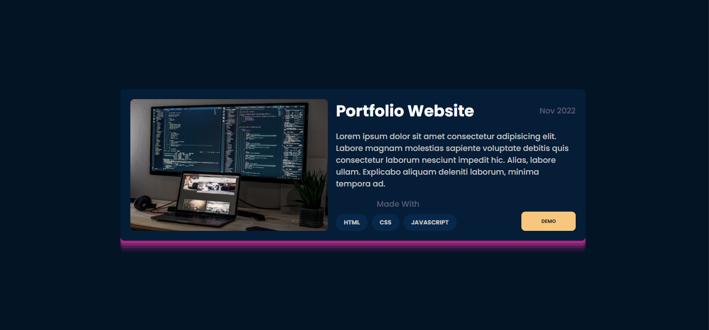
With Everything Setup Your Card should look something like this
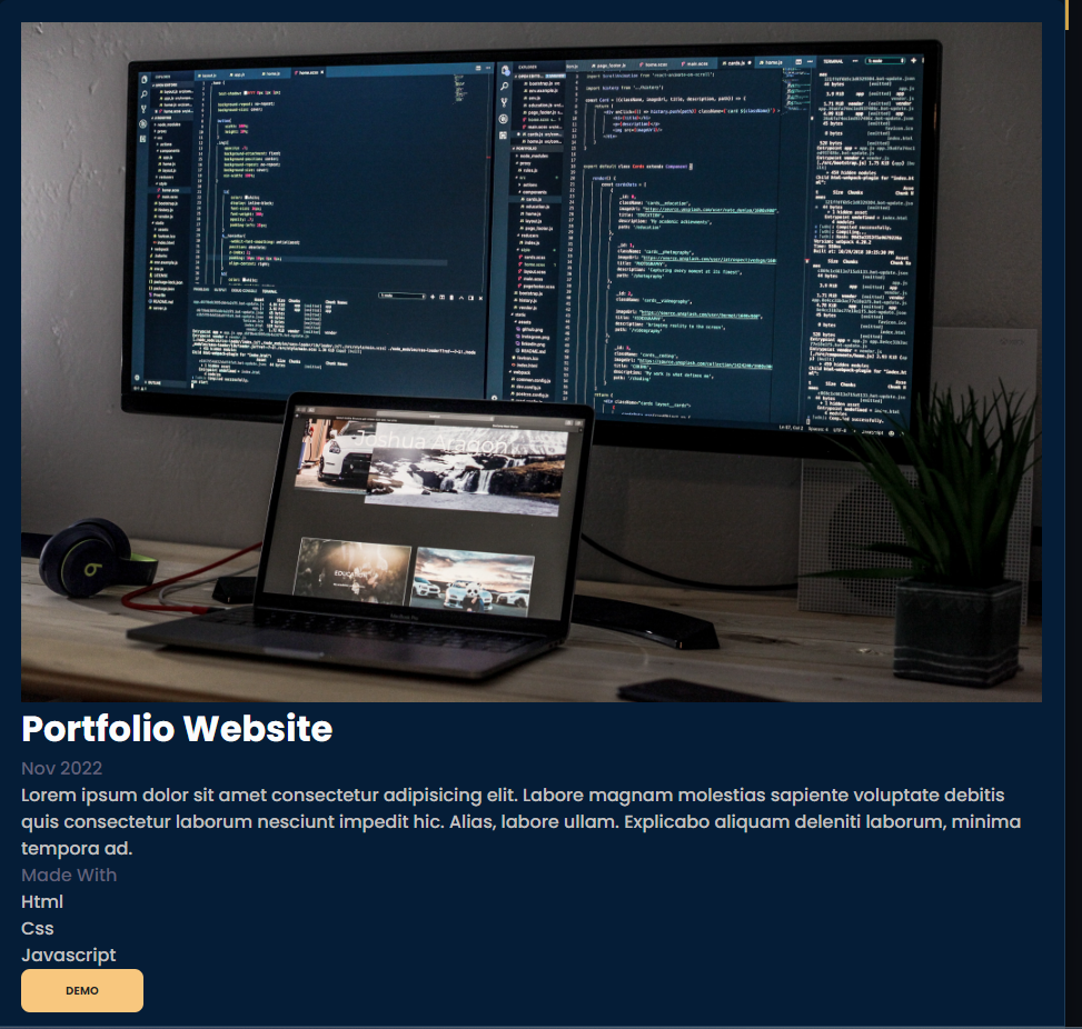
Desktop Layout
Now let start styling it. In our style sheet first write body and declare it as display grid , then place items center and padding of 1rem so that when we start styling our card, it will stay in the center
 body {
  display: grid;
  place-items: center;
  padding: 1rem;
}
After that below body in grid-card class declare this as display grid then give it a gap of 1rem. Then we use grid-template area to have a layout with image on the left side and other content on the right.
 body {
  display: grid;
  place-items: center;
  padding: 1rem;
}

.grid-card {
  display: grid;
  gap: 1rem;
  grid-template-areas:
    "image title date"
    "image discription discription"
    "image madewith demo-button";
}
Now lets give all the classes their respective grid area so first our image class will get grid area of image
body {
  display: grid;
  place-items: center;
  padding: 1rem;
}
.grid-card {
  display: grid;
  gap: 1rem;
  grid-template-areas:
    "image title date"
    "image discription discription"
    "image madewith demo-button";
}
.image {
  grid-area: image;
}
and similarly lets do that with all the other classes as well
body {
  display: grid;
  place-items: center;
  padding: 1rem;
}
.grid-card {
  display: grid;
  gap: 1rem;
  grid-template-areas:
    "image title date"
    "image discription discription"
    "image madewith demo-button";
}
.image {
  grid-area: image;
}
.title {
  grid-area: title;
}
.date {
  grid-area: date;
}
.discription {
  grid-area: discription;
}
.madewith {
  grid-area: madewith;
}
.demo-button {
  grid-area: demo-button;
}
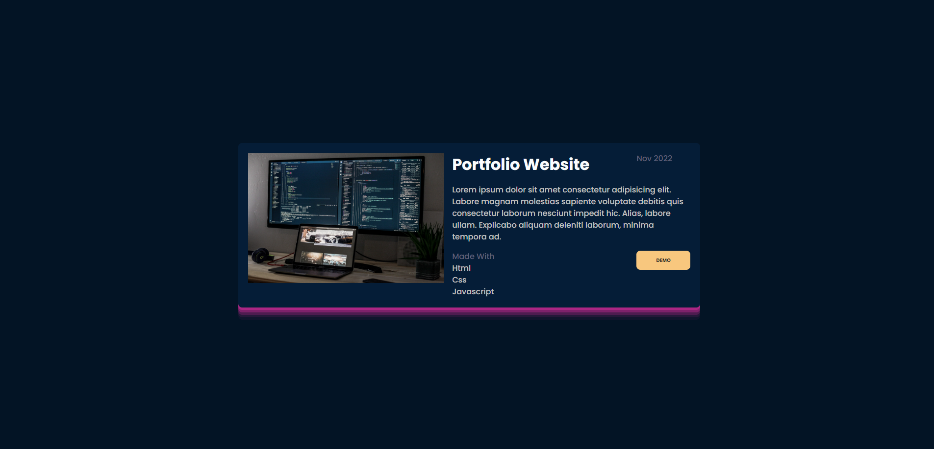
Now everything is exactly where it should be, so lets adjust column size in grid-card with grid template columns so our image, should have a minmax of auto and 480px, then the second column will be minmax of auto and 360px third will be min-content.
.grid-card {
  display: grid;
  gap: 1rem;
  grid-template-areas:
    "image title date"
    "image discription discription"
    "image madewith demo-button";
  grid-template-columns: minmax(auto, 400px) minmax(auto, 360px) min-content;
}
The card before we style everything else should look like this
Now lets start by styling our image. Lest start by giving it a border of 8px and put align-self as stretch then the image will looks kind of stretched so add an object-fit as cover
.image {
  grid-area: image;
  border-radius: var(--border-radius);
  align-self: stretch;
  object-fit: cover;
}
The date class, we will align it to the center and justify it to the end like this.
.date {
  grid-area: date;
  place-self: center end;
}
The discription looks fine and made will needs styling but for now lets align our button to the end like this:
.demo-button {
  grid-area: demo-button;
  align-self: end;
}
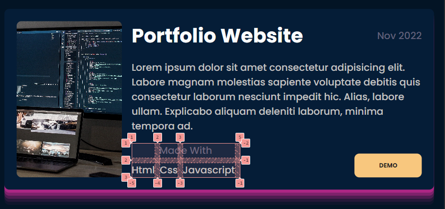
Then lets align our made with to the end and declare it as grid as well. Give it a gap of .5rem then set and set grid template areas as 'madewith-title' four times and set the grid-auto-columns as min-content
.madewith {
  grid-area: madewith;
  align-self: end;
  display: grid;
  gap: 0.5rem;
  grid-template-areas: "madewith-title madewith-title madewith-title madewith-title";
  grid-auto-columns: min-content;
}
and set our madewith-title class as grid-area of madewith-title and justify it to the center.
.madewith-title {
  grid-area: madewith-title;
  justify-self: center;
}
so this basically means that every row will have 4 column and in the first row is taken entirely by madewith-title, and it works perfectly fine.
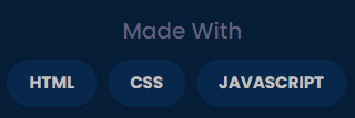
Now for our minwidth-content class we will give it some background custom background color, a border radius to give it a pill shape, some padding on left and right padding-inline and some padding on the top and bottom padding-block then lets make our text uppercase and give the font a certain size and make it bold
.madewith-title {
  grid-area: madewith-title;
  justify-self: center;
}
.madewith-content {
  background-color: var(--color-input-field);
  padding-inline: 1rem;
  padding-block: 0.5rem;
  border-radius: 999px;
  text-transform: uppercase;
  font-size: 12px;
  font-weight: 700;
}
Now our madewith section in total looks something like this.
Now our desktop layout is done
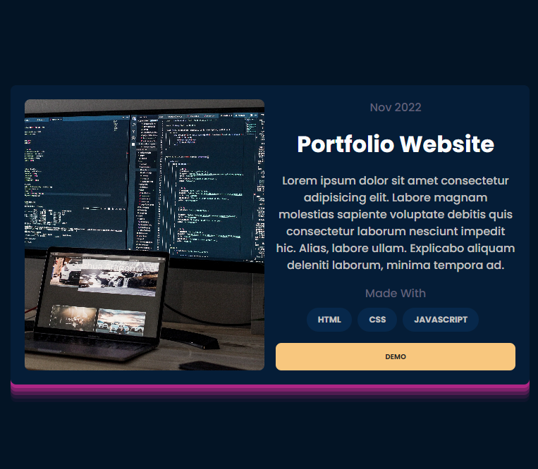
Tablet Layout
Similarly The Tablet layout which is a 2 column layout and looks like this
 can be achived like this
@media only screen and (max-width: 768px) {
  .grid-card {
    grid-template-areas:
      "image date"
      "image title"
      "image discription"
      "image madewith"
      "image demo-button";
    grid-template-columns: 1fr 1fr;
    justify-items: center;
  }
  .date {
    justify-self: center;
  }
  .title {
    justify-self: center;
    text-align: center;
  }
  .discription {
    text-align: center;
  }
  .demo-button {
    justify-self: stretch;
    width: auto;
  }
}
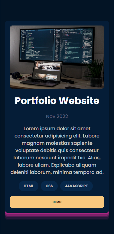
Tablet Layout
Similarly The Tablet layout which is a one column layout and looks like this
 can be written like this
@media only screen and (max-width: 425px) {
  .grid-card {
    grid-template-areas:
      "image"
      "title"
      "date"
      "discription"
      "madewith"
      "demo-button";
    grid-template-columns: 1fr;
    padding: 1rem;
  }
  .madewith-title {
    display: none;
  }
}
So Now the Final HTML and CSS Looks something like this
HTML
<!DOCTYPE html>
<html lang="en">
  <head>
    <meta charset="UTF-8" />
    <meta http-equiv="X-UA-Compatible" content="IE=edge" />
    <meta name="viewport" content="width=device-width, initial-scale=1.0" />
    <link rel="stylesheet" href="style.css" />
    <title>Grid Learning</title>
  </head>
  <body>
    <div class="card grid-card">
      <img src="./image/portfolio Image.jpg" alt="" class="image" />
      <h3 class="title">Portfolio Website</h3>
      <span class="date text-subtle">Nov 2022</span>
      <p class="discription">
        Lorem ipsum dolor sit amet consectetur adipisicing elit. Labore magnam
        molestias sapiente voluptate debitis quis consectetur laborum nesciunt
        impedit hic. Alias, labore ullam. Explicabo aliquam deleniti laborum,
        minima tempora ad.
      </p>
      <div class="madewith">
        <div class="madewith-title text-subtle">Made With</div>
        <div class="madewith-content">Html</div>
        <div class="madewith-content">Css</div>
        <div class="madewith-content">Javascript</div>
      </div>
      <button class="demo-button">Demo</button>
    </div>
  </body>
</html>
CSS
@import url("https://fonts.googleapis.com/css2?family=Poppins:wght@500;700&display=swap");

:root {
  --color-primary: #f8c77e;
  --color-link: #4d62ff;
  --color-success: #77dd66;
  --color-warning: #ffc839;
  --color-danger: #ff6961;
  --color-input-field: #07284b;
  --color-disabled: #06213e;
  --color-card: #051d37;
  --color-background: #031425;
  --color-heading-text: #fafcfd;
  --color-body-text: #c2c1c0;
  --color-button-text: #262624;
  --color-subtle: #61617a;

  --border-radius: 0.5rem;
}

/* Box sizing rules */
*,
*::before,
*::after {
  box-sizing: border-box;
}

/* Remove default margin */
body,
h1,
h2,
h3,
h4,
p,
figure,
blockquote,
dl,
dd {
  margin: 0;
}

/* Remove list styles on ul, ol elements with a list role, which suggests default styling will be removed */
ul[role="list"],
ol[role="list"] {
  list-style: none;
}
/* Set core root defaults */
html:focus-within {
  scroll-behavior: smooth;
}

/* Set core body defaults */

body {
  min-height: 100vh;
  text-rendering: optimizeSpeed;
  line-height: 1.5;
  font-family: "Poppins", sans-serif;
  font-weight: 500;
  background-color: var(--color-background);
  color: var(--color-body-text);
}

h1,
h2,
h3 {
  color: var(--color-heading-text);
}

h1 {
  font-weight: 700;
  font-size: 4rem;
}
h2 {
  font-weight: 700;
  font-size: 3rem;
}
h3 {
  font-weight: 700;
  font-size: 2rem;
}

.subtitle {
  font-size: 1.5rem;
}

.text-small {
  font-size: 0.875rem;
}
.text-subtle {
  color: var(--color-subtle);
}

button {
  display: flex;
  width: fit-content;
  height: fit-content;
  gap: 0.5rem;
  background-color: var(--color-primary);
  color: var(--color-button-text);
  border: none;
  border-radius: var(--border-radius);
  padding-block: 0.75rem;
  padding-inline: 2.5rem;
  font-size: 0.625rem !important;
  font-weight: 700 !important;
  text-transform: uppercase;
  letter-spacing: 3%;
  justify-content: center;
}

.button-success {
  background-color: var(--color-success);
}
.button-warning {
  background-color: var(--color-warning);
}
.button-danger {
  background-color: var(--color-danger);
}

a {
  font-weight: 700;
  color: var(--color-link);
}

input {
  background-color: var(--color-input-field);
  border: none;
  border-radius: 0.5rem;
  padding-block: 0.75rem;
  padding-inline: 0.5rem;
}

input::placeholder,
textarea::placeholder {
  color: var(--color-subtle);
}
input:focus,
textarea:focus {
  color: var(--color-body-text);
  border: var(--color-primary);
  outline: none !important;
  border: 1px solid var(--color-primary);
}

/* A elements that don't have a class get default styles */
a:not([class]) {
  text-decoration-skip-ink: auto;
}

/* Make images easier to work with */
img,
picture {
  max-width: 100%;
  display: block;
}

/* Inherit fonts for inputs and buttons */
input,
button,
textarea,
select {
  font: inherit;
}

/* Remove all animations, transitions and smooth scroll for people that prefer not to see them */
@media (prefers-reduced-motion: reduce) {
  html:focus-within {
    scroll-behavior: auto;
  }

  *,
  *::before,
  *::after {
    animation-duration: 0.01ms !important;
    animation-iteration-count: 1 !important;
    transition-duration: 0.01ms !important;
    scroll-behavior: auto !important;
  }
}

.flex {
  display: flex;
  gap: 0.5rem;
}
.flex-column {
  display: flex;
  flex-direction: column;
  width: fit-content;
  gap: 0.5rem;
}

.bg-primary {
  background-color: var(--color-primary);
}

.card {
  background-color: var(--color-card);
  width: fit-content;
  padding: 20px;
  border-radius: var(--border-radius);
  box-shadow: rgba(240, 46, 170, 0.4) 0px 5px, rgba(240, 46, 170, 0.3) 0px 10px,
    rgba(240, 46, 170, 0.2) 0px 15px, rgba(240, 46, 170, 0.1) 0px 20px,
    rgba(240, 46, 170, 0.05) 0px 25px;
}

/*---------------We made our card from here---------------*/
body {
  display: grid;
  place-items: center;
  padding: 1rem;
}
.grid-card {
  display: grid;
  gap: 1rem;
  grid-template-areas:
    "image title date"
    "image discription discription"
    "image madewith demo-button";
  grid-template-columns: minmax(auto, 400px) minmax(auto, 360px) min-content;
}
.image {
  grid-area: image;
  border-radius: var(--border-radius);
  align-self: stretch;
  object-fit: cover;
}
.title {
  grid-area: title;
}
.date {
  grid-area: date;
  place-self: center end;
}
.discription {
  grid-area: discription;
}
.madewith {
  grid-area: madewith;
  align-self: end;
  display: grid;
  gap: 0.5rem;
  grid-template-areas: "madewith-title madewith-title madewith-title madewith-title";
  grid-auto-columns: min-content;
}
.demo-button {
  grid-area: demo-button;
}
.demo-button {
  grid-area: demo-button;
  align-self: end;
}

.madewith-title {
  grid-area: madewith-title;
  justify-self: center;
}
.madewith-content {
  background-color: var(--color-input-field);
  padding-inline: 1rem;
  padding-block: 0.5rem;
  border-radius: 999px;
  text-transform: uppercase;
  font-size: 12px;
  font-weight: 700;
}

@media only screen and (max-width: 768px) {
  .grid-card {
    grid-template-areas:
      "image date"
      "image title"
      "image discription"
      "image madewith"
      "image demo-button";
    grid-template-columns: 1fr 1fr;
    justify-items: center;
  }

  .date {
    justify-self: center;
  }

  .title {
    justify-self: center;
    text-align: center;
  }
  .discription {
    text-align: center;
  }

  .demo-button {
    justify-self: stretch;
    width: auto;
  }
}
@media only screen and (max-width: 425px) {
  .grid-card {
    grid-template-areas:
      "image"
      "title"
      "date"
      "discription"
      "madewith"
      "demo-button";
    grid-template-columns: 1fr;
    padding: 1rem;
  }
  .madewith-title {
    display: none;
  }
}
I hope this was informative and thankyou for reading

